In the era of Big Data, data visualization tools are essential for unlocking the potential of data and conveying messages effectively. However, choosing the most appropriate charts depends on your objectives and the message you want to convey.
The main types of charts for data visualization
A data visualization tool can support a multitude of graphics. But you still need to know their respective characteristics and functions.
Bar Chart
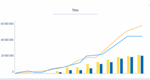
The bar chart is a widely used graphical representation for comparing different elements. One axis of the chart shows the items being compared, and the other axis represents the measured value. Simple to design and understand, it is particularly suitable when presenting numerous categories.
This type of chart can also be used for more complex comparisons by grouping or stacking bars.
Grouped Bar Chart: This chart contains at least two bars for each group, each with a different colour code. For example, a business owner measuring the revenue evolution of two stores could create a grouped bar chart with months of the year on the horizontal axis, revenue on the vertical axis, and different-coloured bars representing each store.
Stacked Bar Chart: This involves overlaying bars representing different groups. The addition of these bars represents the total of the various groups. Note: Stacked bar charts are not suitable if some groups have negative values.
Best Practices:
- Place values directly on the bars for easy readability.
- Add labels to the axes to provide more context to the reader.
- Preferably use a single color (except for grouped and stacked bar charts).
Line Chart
The line chart reveals trends and developments over time and also shows relationships within a continuous set of data. It can be used in various situations, such as representing the traffic evolution of a website or variations in product sales.
Best Practices:
- Axis labels should be clearly named for easy understanding.
- Limit distracting visual elements (bright colours, legends, grid lines, etc.) to highlight the overall trend.
- The chart should not contain more than 5 or 6 lines to avoid visual overload.
Pie Chart
Also known as a circular diagram or a pie chart, is often used to show the different parts of a whole. Each “slice” represents a data category, and its size is proportional to the percentage of the total sum it represents.
Best Practices:
- Avoid comparing too many categories at once to ensure chart readability.
- If the slices are of similar size, consider using a bar chart or histogram to make the difference more noticeable.
Histogram
The histogram represents the distribution of the values of a continuous variable over a certain period of time. For each group, we construct a bar whose base corresponds to the values and the height corresponds to the number of observations in the group.
For example, the number of employees can be represented on the y-axis, and salary bands on the x-axis. In this way, the histogram provides a quick overview of employee remuneration.
In addition, this type of chart is useful for estimating the concentration of values and identifying deviations, extremes, or outliers. An analysis of the histogram gives a clear idea of the distribution of values.
Best Practices:
- Avoid adding too many colours to the chart; use shades of a single colour instead. However, it is possible to colour a specific bar that you want to highlight in your analysis.
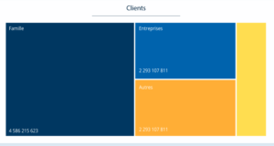
Treemap
A proportional map is a graphical representation of hierarchical data. Visually, it’s a nest of squares and rectangles whose colour and size vary according to the associated value. In general, the size of a square represents a quantity, while its colour expresses a category.
The proportional map is ideal for identifying trends or making quick comparisons, especially if one colour stands out. What’s more, it allows you to condense hundreds of thousands of items of information into an organized representation occupying a small space, making them easier to understand.
Best Practices:
- Use bright, contrasting colours to highlight the different areas of the map. Be careful, though, to avoid overloading the chart.
- To simplify reading, assign a label to each region of the map.
- Although a proportional map can contain a multitude of boxes, these should not be too numerous to ensure that the representation remains comprehensible.
Area Chart
The area chart, in some aspects, resembles the line chart. Both allow for showing trends over time, general trends, and the continuity of a set of data. However, in an area chart, the space between the curve and the axes is colored to indicate a volume.
For example, a line chart is useful for showing the evolution of a population over time. The area chart, on the other hand, allows tracking this evolution and representing the total population over the years.
In data visualization, this representation is also used to compare two or more quantities by displaying cumulative totals using numbers or percentages: this is called a stacked area chart.
Best Practices:
- If you have multiple datasets and want to highlight differences between these categories, prefer a stacked area chart.
- To ensure readability, avoid comparing too many datasets.
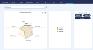
Radar Chart
The radar chart is sometimes called a spider chart because of its appearance: a polygon divided by several rays, on which the values of the data are represented.
The radar chart is ideal for making comparisons between multiple elements based on cyclical data. It is also very practical for highlighting differences, similarities, or outliers. It is more suitable when datasets are small or medium.
Best Practices:
- The radar chart should include at least three variables arranged in a meaningful order.
- To avoid making the chart unreadable, limit the number of represented variables.
Scatter Plot
The scatter plot (also known as a scatter chart or scatter graph) is often used to present relationships between two variables. It is particularly useful when the values of the variable on the vertical axis depend on the values of the variable on the horizontal axis. In this type of chart, points are placed without being connected. They show a trend that indicates the type and strength of the relationship between variables.
The scatter plot can be used for several purposes: understanding how one variable influences another, finding irregularities, or identifying a correlation, trend, or pattern.
Best Practices:
- The scatter plot lends itself well to representing a large amount of data. Unlike other graphs, it does not lose clarity even if it contains a large volume of information.
- To highlight the most relevant data and facilitate reading, it is possible to vary the size and color of the points.
Bubble Chart
The bubble chart is a variation of the scatter plot.It is particularly useful when the values of the variable on the vertical axis depend on the values of the variable on the horizontal axis. In this type of graph, the points are placed without being connected. They then show a trend that indicates the type and strength of the relationship between the variables.
Best Practices:
- Use different colors to distinguish categories, while using transparency to highlight relationships between them.
- Limit the number of elements to analyze to maintain readability.
Waterfall Chart
A waterfall chart represents a cumulative total as values are added or subtracted. It is very useful for understanding how an initial value is affected by other values, whether positive or negative. Thus, the waterfall chart is used to measure a key performance indicator (KPI) while analyzing positive and negative factors impacting it.
For illustration:
- The first column represents merchandise sales.
- The second represents the cost of goods sold.
- The third represents the gross margin.
The waterfall chart allows for visualizing not only the margin but also the elements that compose it (merchandise sales – cost of goods sold).
How to choose the right chart for data visualization?
To visualize data using a data visualization tool, choosing an appropriate chart is essential.
Whether you want to drive your marketing strategy with data, track your sales performance or assess your financial health, you’ll need to find the ideal representation to achieve your goals.
Several criteria should be considered:
- Context: What is the purpose of data visualization, and to what audience will it be presented? What do you want to show?
- Nature of Data: Is it financial, geographical, socio-demographic, commercial data?
- Objective of Data Visualization: What do you want to highlight through data analysis? It could be a trend over time, ranking, distribution, correlation, or comparison.
Overall, graphical representations can be divided into four broad categories, depending on what you want to show.
Comparison
As their name suggests, comparison charts are used to compare one or more sets of data, as well as to highlight differences over time.
- For a comparison between several elements, the bar chart is essentially used. If you want to compare several categories, you can also use a table containing several graphs.
- For a comparison over time, the curve chart is preferred, but the bar chart can also be used.
Relationships
Graphs in this category are used to show a connection or correlation between two or more variables.
The representation used depends mainly on the number of variables.
- The scatter plot is ideal for representing two variables.
- A bubble chart is ideal for three variables.
Distribution
These graphs can be used to identify trends or irregularities by showing how variables are distributed over time.
Here again, the choice of graph depends on the number of variables:
- For a single variable, we opt for a histogram or a curve.
- For two variables, a scatter plot is more appropriate.
Composition
Composition graphs are used to display the parts of a whole at a given point in time or to track their evolution over time.
- For a static representation, we use the pie chart, the cascade diagram, or the proportional chart.
- For data that evolves over time, the stacked bar chart and the area chart are the most suitable.
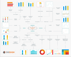
In case of doubt, this little infographic will help you quickly find the best graphic representation for your data and become a data-driven company:
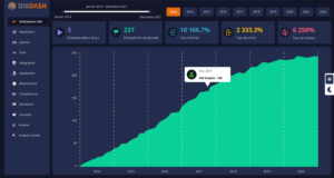
Now, you have all the tools to choose the most suitable types of charts for your data and tell compelling stories with your data visualizations. All that’s left is to gather them in a dynamic dashboard to manage your performance and improve your daily decision-making. DigDash Enterprise, a Business Intelligence solution, allows you to design custom dashboards that are user-friendly and tailored to your business specifics, with aesthetically pleasing and understandable charts for your entire team.