In this new 2019 edition, DigDash Enterprise includes forty new features. The main developments concern the creative studio and graphics! The data model and dashboards are not left out.
In the spirit of continuous improvement, the design and development teams strive to anticipate your needs so that our tool can best meet their desires for visualization and representation of their data.
The creative studio gets a new look
-
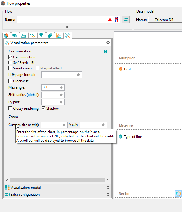
Improvement of the user experience
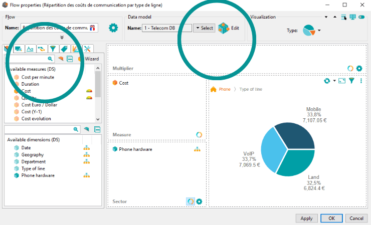
Ergonomics and intuitive user guidance have been at the heart of the thinking process to review the interface and save time when designing graphics.
For example, when editing a graph, the selection of the data source, and the configuration of the visualization, have been grouped together on the same page. The previously accessible properties, in the form of buttons, have been replaced by tabs allowing to directly preview the changes made.
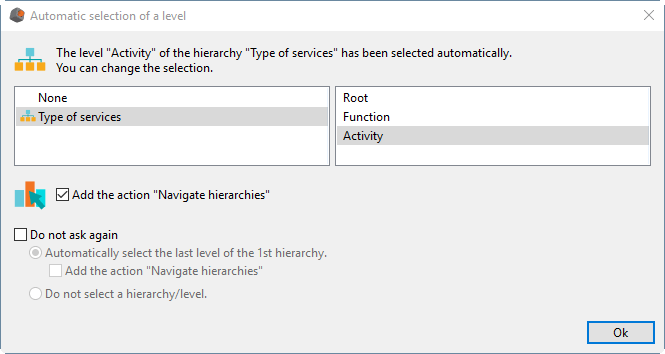
When adding a dimension containing a hierarchy, an assistant now allows you to select the desired hierarchy level and the ability to navigate it. We can dispense with the assistant by asking it to retain default settings to apply.
Another assistant allows creating calculated measures on the fly in the data model or the graph itself. For example, these calculated measures can be of transformer type (year -1, month -1, …) or more general (% of total,% of measurements, …).
In the dynamics of self-service BI, simply drag and drop the function to the chosen measure so that the tool automatically creates the new measurement.
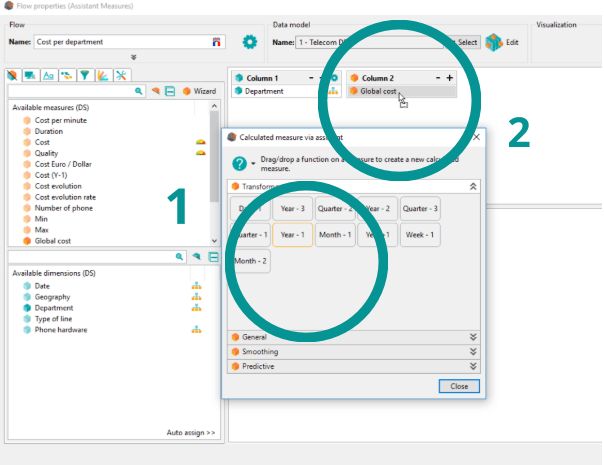
Drag and drop the “Year-1” function on the “Overall cost” measure
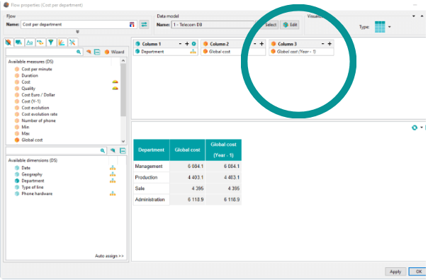
Get the new measure “Overall cost (Year -1)” in your table
The help offered in the interface assists you in the configuration of your graphics and saves you time thanks to a bubble that appears on the buttons.
This visualization offers a description and examples of the different options available simply by going over the heading.
-
Simplification of the translation manager
From now on, you have the option to export the metadata you want to translate.
The big advantage of this function is to be able to re-import large volumes of translated data without having to treat them by hand one by one.
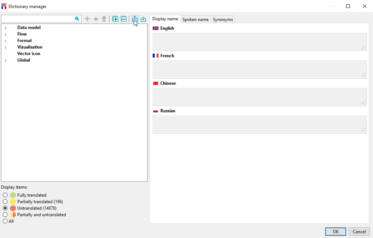
Example: You can export only “untranslated” data.
The graphics are changing too!
-
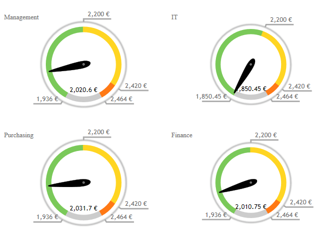
Evolution of performance graphs
The notion of multiplier axis, which already existed in the comparison graphs (column graphs, bar graphs …) has been applied to performance graphs.
This is particularly the case for gauges. You can display the same gauge for multiple members of a dimension, such as years or regions. This feature saves you from recreating the gauge for each value.
-
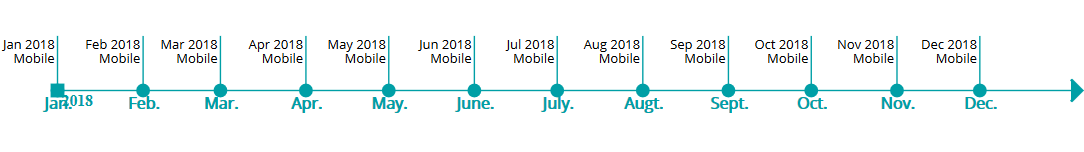
New types of graphs
Several types of graphs have been added in this DigDash Enterprise evolution.
First, a graphical timeline appears. Previously represented in a table, it is now available in a graph. It allows having a visualization of several elements on a time axis with reference points.
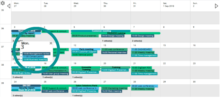
A brand new “Calendar” chart has been added to our new features.
Based on your data model, it allows you to view a calendar with events in the Google Calendar style.
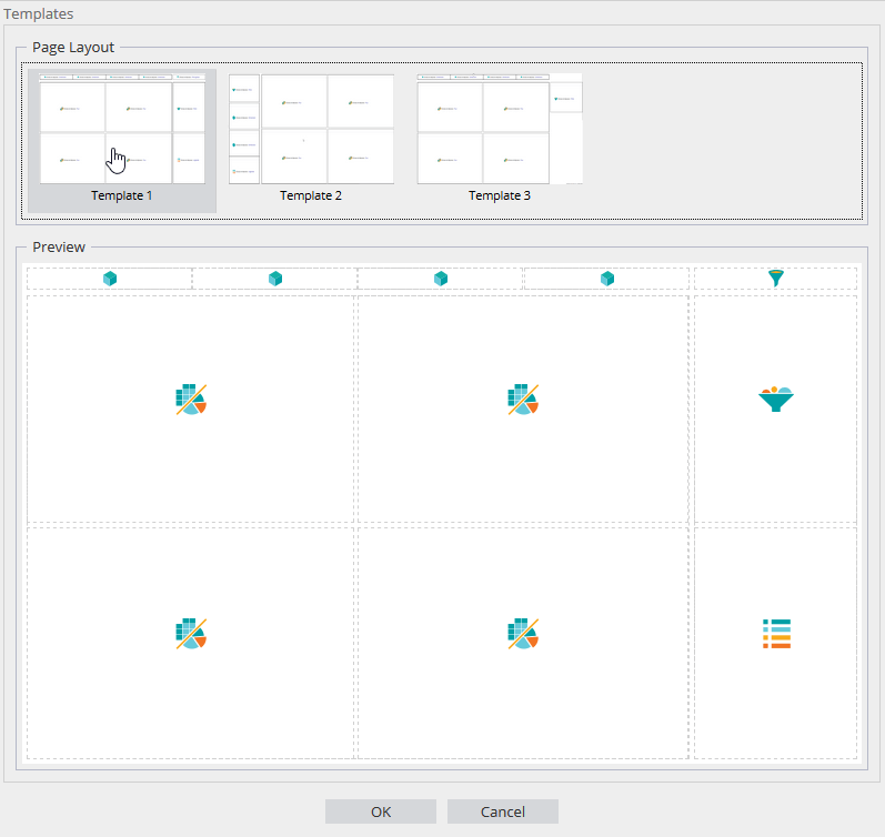
An optimized dashboard interface
DigDash Enterprise opens new possibilities with the addition of dashboard page templates.
Indeed, they allow you to create easily your own pages with predefined templates. These models, especially designed and optimized for data management and visualization, assist you in creating clear and explicit dashboards.
Among the new features, you can share objects as a link. Changes made on the source object are synchronized and directly visible on each linked object.
Also, you have the option to change the display settings of multiple items simultaneously. For example, select backup options, enable magnification and even change the style of your graphics …
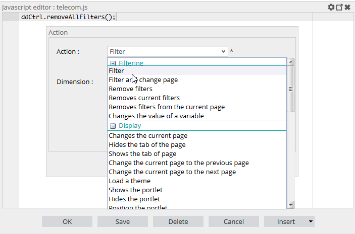
This new interface also makes it easy to add various functions to the dashboards. Javascript code writing is facilitated thanks to predefined lists of functions (filtering, refresh …)
When viewing the dashboard, the interface provides a smoother and faster graph display system.
As you can see, this update is truly centered around your needs. We are committed to offering you the solution that best accompanies you in your Business Intelligence approach.