With its focus on ergonomics, the update of the 2019 version of DigDash Enterprise is looking to modernize.
Beyond the new features, it has made browsing through the tool far easier.
More agile, it is intended to greatly enhance the user experience.
These time-saving developments apply as much to the dashboards and graphs, as to the studio and document creation.
The creative studio has been improved again
-
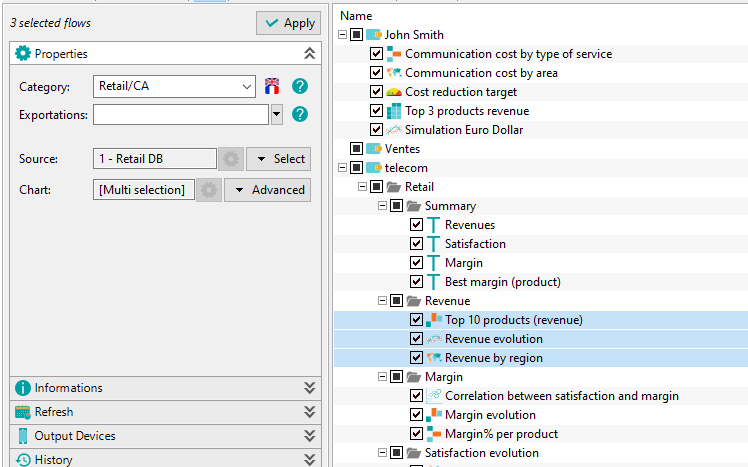
A new control panel
You can modify graphs and Wallets properties without having to edit them individually.
It is no longer necessary to open your graphs again in order to change their name, data source or even update times for example.
One of the advantages is the ability to change the properties of several graphs at the same time by using the multi-selection.
-
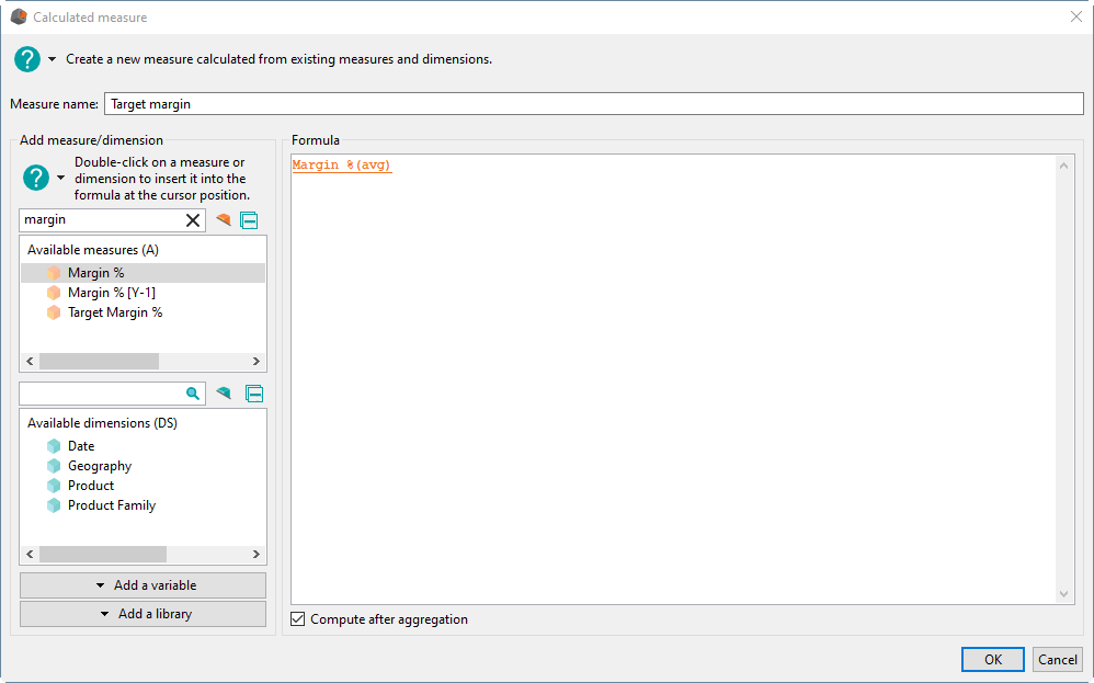
Data models
When it comes to creating derived measures, the interface has developed and become more intuitive.
It allows the selection of measures and dimensions from lists containing, among other things, search fields.
Previously, this task required a manual search of drop-down lists.
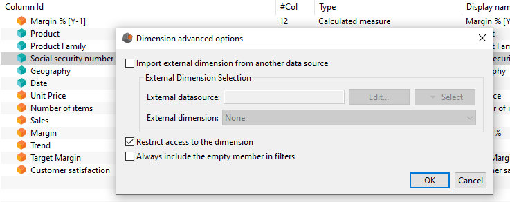
Furthermore, in order to increase the security and confidentiality of your sensitive data, DigDash now offers you a GDPR-oriented functionality.
This means you can restrict access to specific dimensions containing confidential information. Only authorized users can access the data in these dimensions
-
Dependency analysis
Now you can determine and analyze the dependencies of your metadata, such as formats and measures.
From now on, you will be able to see how your resources are used and you’ll be able to carry out processing in a secure manner.
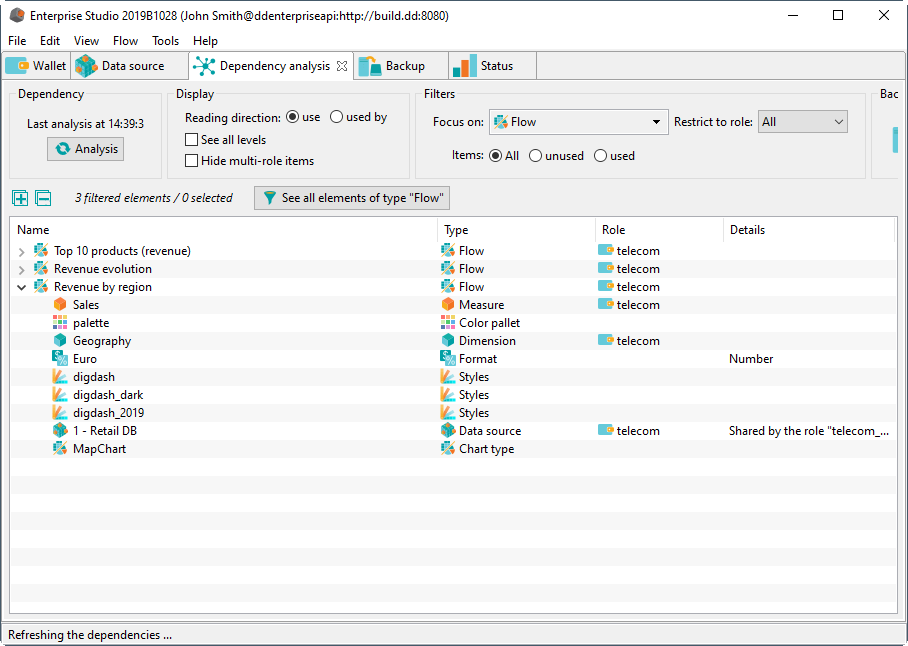
For example, if you try to delete a used element (format, color palette …), DigDash Enterprise will alert you.
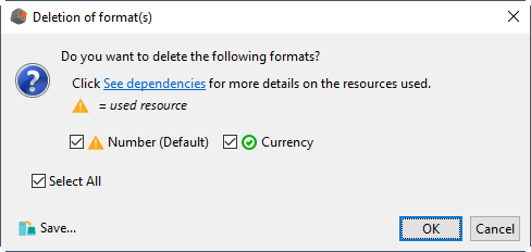
Regarding dependencies, don’t miss the functionality on the intelligent backup at the end of this article.
New graphic features!
-
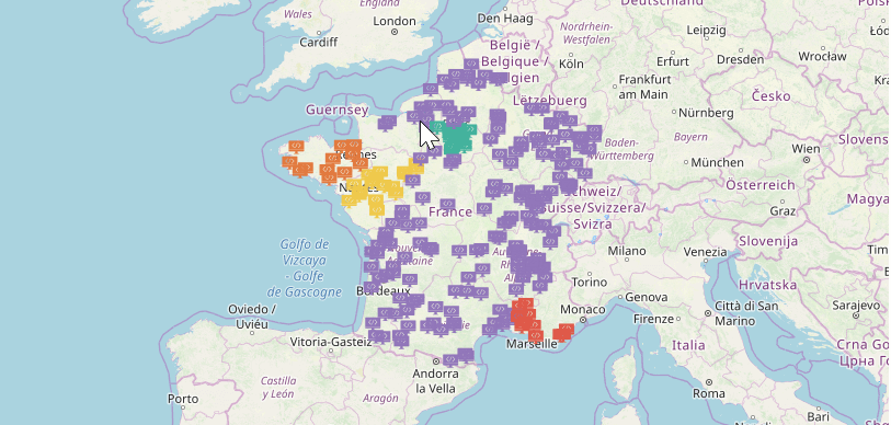
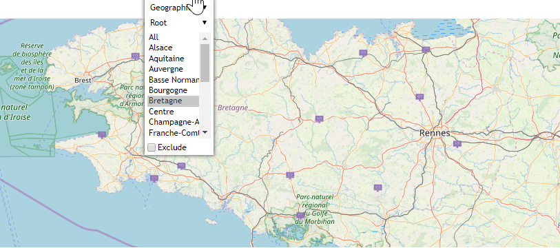
New features for OpenStreetMap maps
Thanks to the OpenStreetMap database, it is possible to make queries to display elements on the map (e.g. points of interest, waterways, etc.)
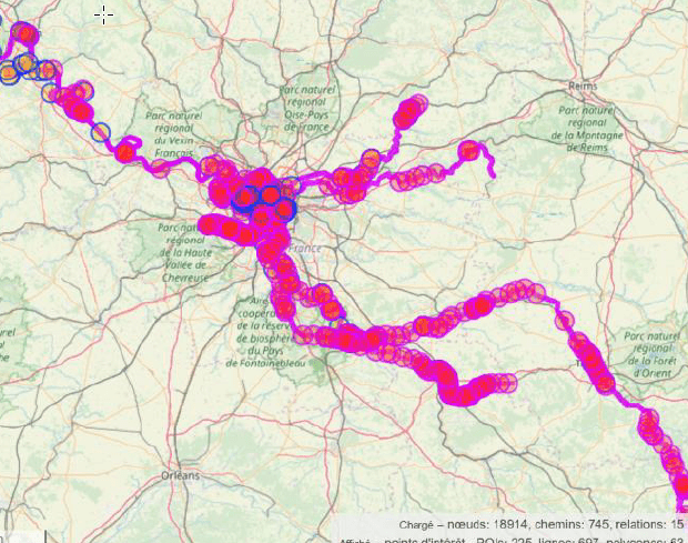
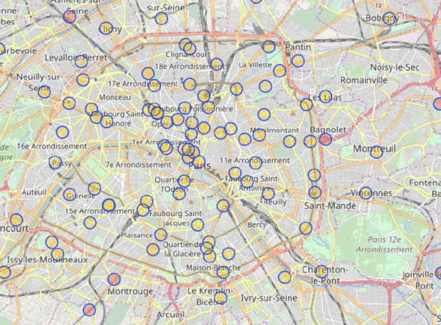
That’s not all, as new options are being released.
– The modification of the infographics according to zoom level
– The display of value labels :
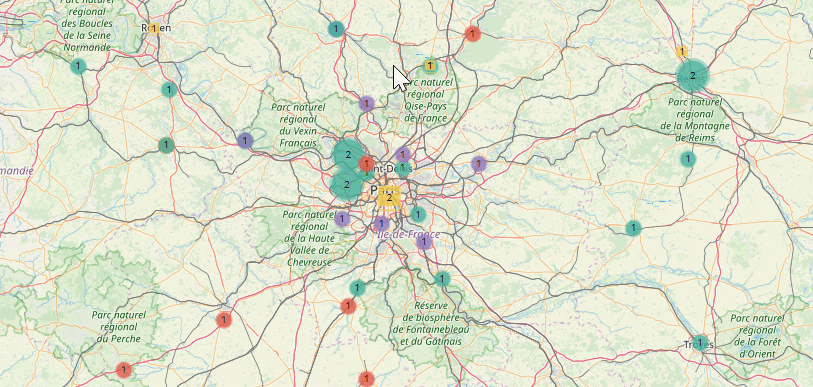
– Automatic zoom on a given element :
-
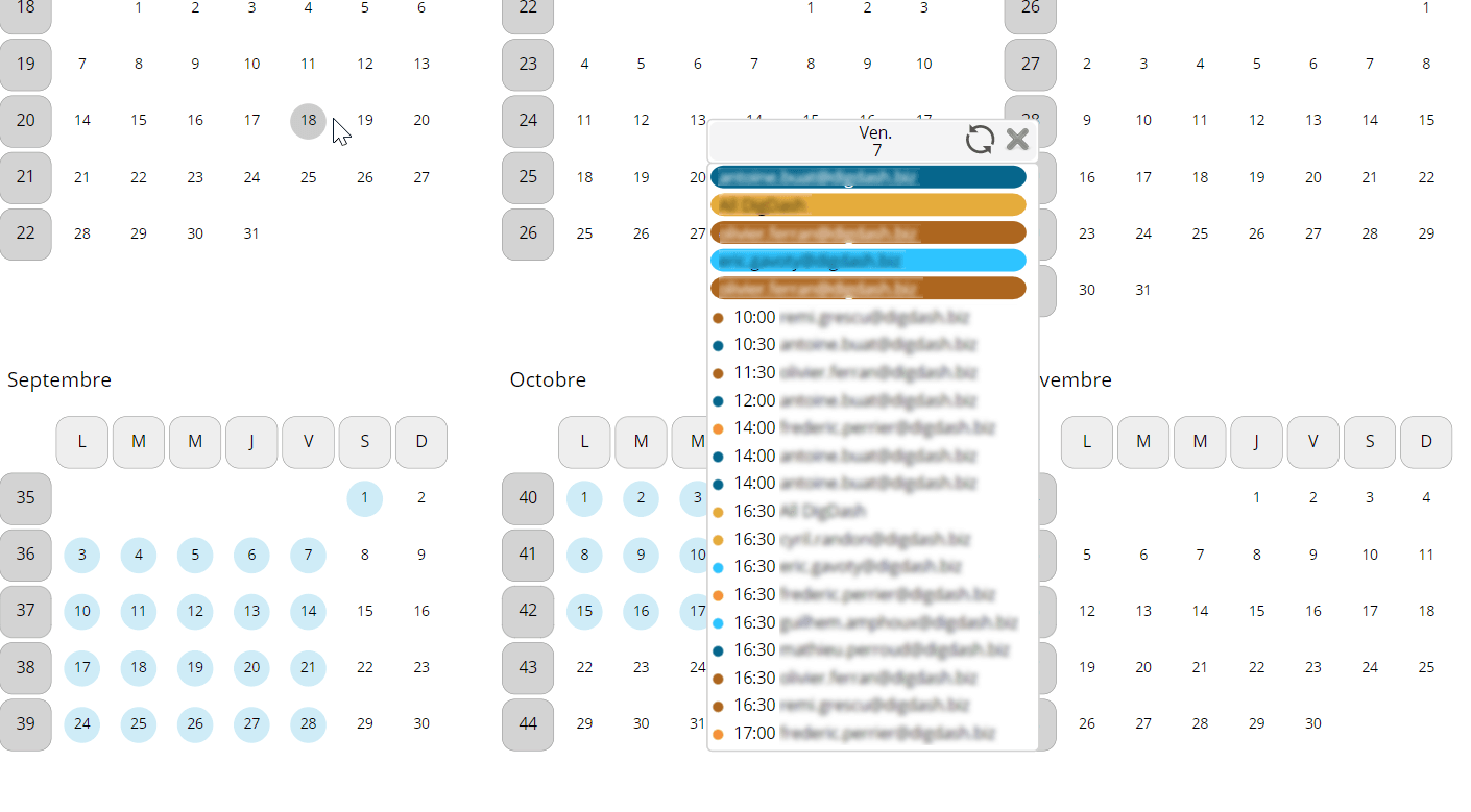
New features in calendars and energy bars
The ‘Calendar’ graph proposed at the beginning of the year has a new display.
In addition to the week and month views, it is now available with a ‘year view’.
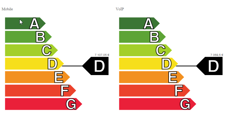
The concept of a multiplication axis, which already exists in comparison and performance graphs, is available on ‘energy bar’ graphs.
So it is now possible to display several ‘energy bars’ on the same graph, one for each member of a dimension.
 By right-clicking on an element, you can also add comments to your graphs directly from the dashboard.
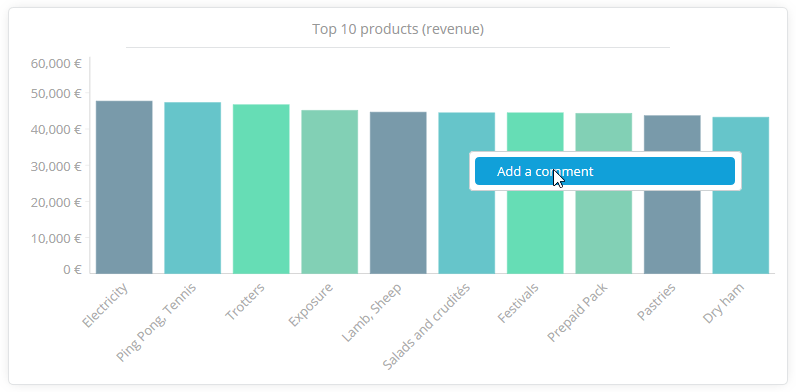 Right-click on the graph to add a comment
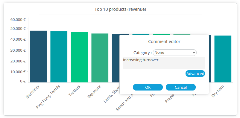
Edit and submit your comment
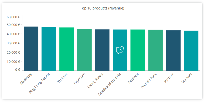 Comments are represented by a visual element (icon, text, etc.)
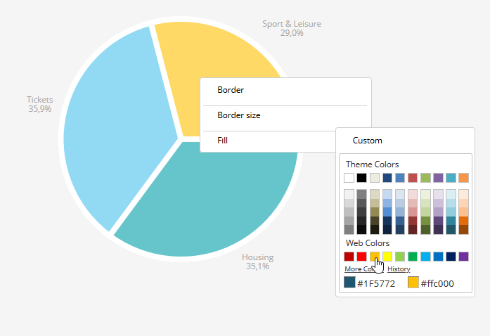
Modifying the graph style (border, border size, color) can be done directly from the dashboard editor without having to edit style sheets manually.
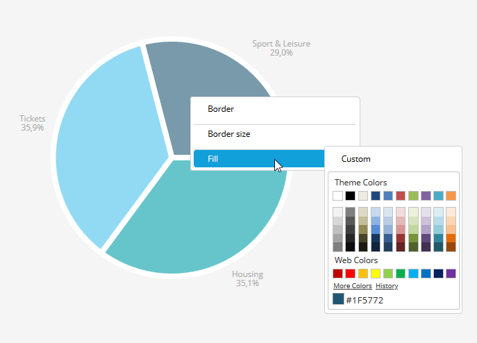
Right-click on the graph to make an action
PDF and PowerPoint convert feature has been modernized
In terms of document creation, and in keeping with our drive to improve your user experience, Digdash Enterprise now offers you the ability to view changes to PDF and PowerPoint documents in real time.
Following the principle of the WYSIWYG (What You See Is What You Get), you can now check the layout of your final document without having to leave the editor.
Among the new features, DigDash Enterprise allows you to add conditions when editing a PDF.
This means that you can decide on displaying a graph according to certain preconditions. This is particularly useful for editing several identical documents where only the graphs are different.
Increasingly smooth dashboards
-
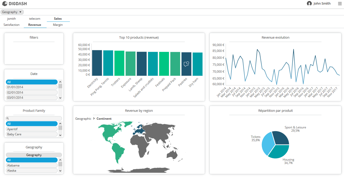
A new dashboard design
The design has been modernized with the launch of a new theme.
This more rounded and modern theme features new icons, more spacing, drop shadows, more contrasting elements, etc. When taken together, these elements provide consistency to your pages.
Through a less cluttered and therefore more pleasant reading experience, you save a considerable amount of time.
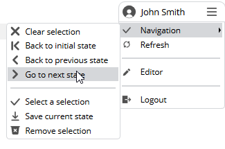
The old user menu (editing, logout) in horizontal format has been replaced by a more ergonomic menu.
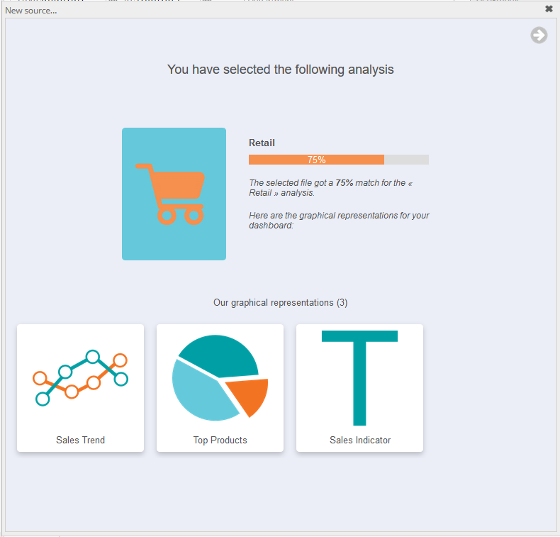
You will also discover a new interface for guided analysis.
As you might recall, DigDash performs a contextual analysis of your file and suggests the most appropriate graphic representations.
-
Simplified filtering
The addition of dashboard filters on pages or graphs has been simplified, as you can now avoid programming in Javascript.
Adding filters is now possible by simply right-clicking to choose display items from a drop-down list.
The filters can be of the private type, applied only to a given page, or of the public type, propagated to other pages.
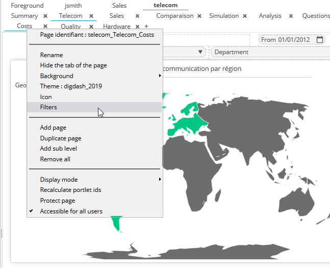
Right-click to select the menu action to be carried out, here are the filters
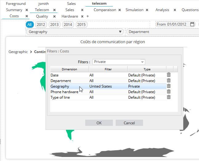
Choice of filter type
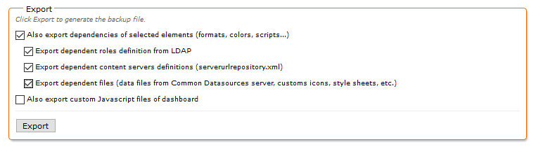
Intelligent backup
Get the most out of the intelligent backup today!
Where before it had to be done manually, it is now possible to automatically export all the objects linked with a selected element (formats, colors, scripts, etc.).
Once again, this update focuses on ease of navigation, ergonomics, fluidity and overall coherence.
We are always attentive to your needs, and your satisfaction is our priority. We are committed to providing you with the resources you need to excel in your Business Intelligence projects through intuitive, dynamic, and increasingly agile dashboards.